Posts

Showing posts from September, 2016

Disney-fied

Image
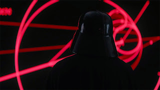
So we have another Force Friday - this time, focusing on Rogue 1 stuffs. Mind you, i realized the quality of the merchandise had dropped tremendously ( not the price though ). For the guys in the states, it's ok still as a figure just costs them 4 bucks. Not here in Malaysia ( and our pathetic conversion rates doesnt help too) making this hobby expensive. A normal figure that costs around Ringgit Malaysia 50........no way man - i rather spend this sort of amount for a decent meal - rather than having a stiff - badly - sculpted mass produced figure. The figures released now are no longer articulated like the Hasbro/Kenner ones. Take a look at the older versions of Fett - tons of articulation offered.  I kinda dig this..... and now in 2016 - we have this instead.... a stiffy, static Fett.  And yes - Hasbro still own this profitable license ( remember we have another 2 more episodes to go ), the animated versions and yes spin offs - so this will rake in billion

Stranger Things

Image
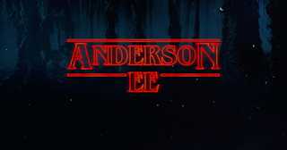
Stranger Things = ET + Stand By Me + recycled culture + romantic hipsterism + analog + The Goonies. Netflix scored again with their vast materials - from Pablo and now a re-hashed 80's for the millenials who didnt have a chance  to experience the analog culture.  Seriously i hated doing mix-tape as we need to time it properly and i didnt know when the song going to appear again - what is worst is when the DJ cant stop yapping....

The Futurists

Image
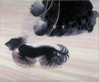
Meet the Futurists - a movement based on rejection of the past, and a celebration of speed ( thanks to Industrial Revolution and World War 1 ), machinery, violence, youth and industry. Even though they are considered radical,weird and occasionally gila, their works expanded our visual language. Here's an example - Dynamism of a dog on a leash by Giacomo Balla. Boccionni's sculpture - he suspended movement   how they visualize sound.

H is for.....

Image
Hector Salamanca, pencil on paper, 2015

Do It Right

Image
China complained the Mat Salleh's is more Chinese than themselves in Kung Fu Panda 3, and now we have Kubo. Beautiful - beautiful storytelling and they revisit George Harrison's classic track. It's either you DO it right or dont DO at all. TQ Laika seriously i had enough excuses man for people who kept giving them reasons offering us lame stuffs.

Bale

Image
sorry Keaton, by far Bale still is the best Batsy pencil on paper, 2015 Keaton - post Beetlejuice, fans got mad when they knew Burton cast him as the caped crusader, he pulled it off somehow - overshadowed by the colorful Nicholson. Keaton add weight in the sequel - loved it when he go toe to toe with Pfeiffer. Val - average ( the start where Batman goes Kaleidoscope ) Clooney - luckily his career doesn't derail after he step unto the suit, bad writing, bad visuals, corny lines, nipples and yes of course, his shaky bat-ears. Bale - pure angst, love how he handle his younger Bruce days, his inner struggle and banter with Caine.Just too bad Nolan and company limped in the third act.  Affleck- bigger and bolder and more violent - lets see if he able to dethrone Bale in this.

The Making of Palik

Image
its normal to draft out several versions of storyboard and screenplay, right until the shooting day. Keyword here is economical, practical and fast. I dont believe in spending alot of time in location ( we are not in Hollywood anyway ), the first draft was submitted way before we went to Kg Gumbang, the story was tweaked when we spend 2 solid days in recce. After the 3rd draft - we are good to go. So here you guys can see what is drafted and what's in the final cut we decided to have fun in the mean time - while setting up. we have Azim ( DOP Assist ) to stand in supposed to get a river shot, but we went for an adventure instead. there is no such thing as "getting inspired" when you are in the set as we are playing with time, actors and the crews, seriously everything need to be drafted - visualized way - way before you ROLL. to ensure everything goes well and get all the shots you wanted. disclaimer - you simply have n

Narcos Season 2

Image
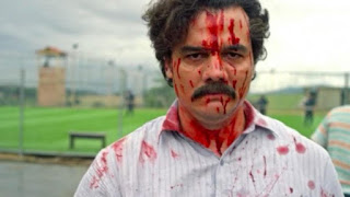
binged on Narcos Season 2 immediately after my trip from Kg Gumbang. The second season focused more on the last days of Pablo, opened up and expand the Cali Cartel. It's inconsistent flow - jarring at times made it an uneasy experience ( just like Breaking Bad season 3 - where we get too much on Jesse, Skyler and her annoying sister and yes Walter White Jr ), cant blame them as they need to weigh in the excellent bitch Judy and the colorful Los Pepes. La Cathredal  Season 1 is better as it's cohesive and it's arranged pretty well. Even though we been introduced by tons of characters esp Gustavo Gaviria ( my heart ache when he is dead in the first season ), the colorful - cartoony sicarios, the Presidents and Colonel Carillo, Wagner Moura anchored it pretty well - giving us ample time and space lapping it up. Loved it when it comes to HOW - they round it up in the finale, beautiful..... Well.....Season 2 - its just inconsistent. Netflix - you did good man....Narcos a

Chan Fee Ming and Framing

Image
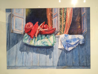
its all about framing and how you place the subjects. Visited Chang Fee Ming's solo exhibition held in Sasana Kijang, Bank Negara. His watercolors is brilliant. What is nice - is his ability making audiences interact with his works, contributing to his establishing shots e.g - what's going on behind the windows - checking out if anyone's home. You will get these sort of scenes locally, where our dear mothers will dry out the family pillows ( bantal busuk - due to our air liur basi ) in the hot sun.  yohoooo.....siapa ada kat dalam oi? rather than showing all, he brilliantly placed his angle - making audience see his perspective, in film/ technical language - we call this MCU ( medium close up ) I dig this!! Of course people will go oooh, ahhhh with his works and get awed with his skills - but what is brilliant is, his works does not carry pretentious/pseudo intellectual subject matter, going beyond non-political, homely and warm. Now that is

Better Call Soul

Image
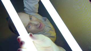
Better Call Saul - a quieter, reflective,subtle cousin of Breaking Bad. The creatives did an amazing job in pulling this off. Season 2 is soulful careful focused stroke than it's first season. Composition and their lighting here is superb. Take a look. Every frame will make Carravagio smirk.  And yes, the episode Fifi stands out man!!! Brilliant.